Affordable Art Fair NYC: The Editor’s Cut

I had the privilege of checking out the Affordable Art Fair this morning before it was opened up to the public later in the day (thanks to HGTV & Antonio Ballatore‘s sneak preview lunch). Here were the absolute highlights (for me) and they might still be for sale if you hurry! (hover over each photo for the artists’ names)

The Tables Have Turned…

Last night I attended my favorite annual DIFFA (Design Industries Foundation Fighting AIDS) event, Dining by Design, hosted by Architectural Digest. It’s an intimate and lively party where internationally celebrated designers and local talent create inspiring three dimensional dining installations. Nestled up against Architectural Digest’s Home Design Show at Pier 94, this oasis of extraordinary dining environments sets the stage for five days of fundraising.

Every year, I look forward to the the feast of visual and culinary inspiration that is DBD, and I was not disappointed. Chef Geoffrey Zakarian of The Lambs Club had crazy-delicious bites in Chinese soup spoons—one with a scallop and another with an english pea puree—and Effen Vodka was serving up delectable cucumber-vodka tonics. Tonight will be the second part of DBD: a $500/ticket gala dinner where attendees will dine in the dreamed-up spaces and then dance the night away.

The installations will be on display to the public today through Sunday. Tickets are $25 and benefit DIFFA.

Here’s a sneak peek…

I loved Design Within Reach’s (table above) miniatures (below) at each setting!
Loved the chairs at Domoore Designs table (below)

The equestrian references all over Eric Warner’s table (below) were clever and chic. Note bridal gear around light and hanging stirrup votives and I LOVE LOVE LOVED the plates! Side note: good use of Baccarat glassware.


Goil Amornvivat (you may recognize him from Bravo’s Top Design) & Tom Morbitzer’s (above) totally CNC-cut setting (below)—with American and Thai (Goil was born in Bangkok) references—was very cool. See their Frenchies in the background under the rainbow. Godzilla: very funny cliche reference. Love it.

Jonathan Adler did a stellar job with Kravet‘s table (below). I love his use of bathroom fixtures (?) as handles on the back of each section of the table. The backs of each seat are the walls of the unit.


Had a blast (drinking La Crema wine, a hugely-generous sponsor of the event) with friend, Marc Blackwell, at his gorgeous bar-height table (below). I particularly loved his filament fixture that ran the length of the table.


Marimekko’s wild and fabulous table was a serious show-stopper (below). LOVE!

Mark Cunningham‘s table (below) was definitely one of my favorites of the night. From the slatted walls to the leather chargers, it was warm, handsome and well-built. Absolutely gorgeous!


My husband, Ryerson Kipp (above), of The DSM Group admiring Maya Romanoff‘s golden palace of a table. When gabbing with (the handsome and elegant) Vicente Wolf, he said that—while he did not do a table this year—he helped these guys with their installation.
I thought the flooring (below) was made of placemats (which would be a really cool idea for a small space!), but I think they are samples of Romanoff surfaces.

And below is my favorite of the evening was this gem by Shawn Henderson Interior Design

New York Time’s table by DDC (below) was was a good example of how sometimes having strong pieces that speak for themselves is enough. The Baccarat chandelier is amazing and I love the tall Marcel Wanders piece in the middle. His collections for Baccarat are pure brilliance.

Pratt Institute
‘s table (below) wasn’t the most aspirational of spaces but it had a few really interesting things going on. Note the woven tabletop.

The Ralph Lauren team knocked it out of the park again with their super luscious lodge that was just the right mix of horn, fur and fire (below).

This table by RYDC was really fun. I loved the contrast of crustacean-laiden coral with high-shine lucite chairs (below).

This strung-out table (below) was by no means cozy, but it was BEAUTIFUL and so photogenic! The reflection of the long, narrow fixture in the tabletop was outrageous and all the materials used really spoke to one another. I think this is a good example of a wildly successful installation for this kind of event. Some tables are amazing in person but terrible in photos. This one was striking in person and even more so on film.

Swarovski’s table (below) was wild with wrap-around flat screens playing sparkly, blue video. At each place-setting: platinum Aegean china by always-ultra-glamorous (yet practical) L’Objet.


I really loved the floral arrangements from Maya Romanoff’s table (below) and Liebherr’s table (far below). Very fresh and springy!

Dangling Karats


LOVING the jewelry of designer, Arielle Ratner. She lives and works (out of her home studio) in Williamsburg, Brooklyn, and spends her weekends riding her horse, Tycoon, in the “farm country” of Pennsylvania, where she hails from. She’s completely adorable:
What do you love about Williamsburg?
This neighborhood has everything a young artist wants; inexpensive and eclectic restaurants, interesting nightlife and music, and great parks. It is close enough to get to Manhattan, but far enough away.

Favorite local spot? Lately I’ve been obsessed with the Roebling Tea Room. They have one of the best burgers in town, a great brunch menu and delicious Bloody Marys!

Name someone in the industry that you admire. Pippa Small: she is a designer first and foremost, but also an incredible philanthropist and a successful role model in jewelry micro-financing. Like Pipa, I have large goals of giving back and I try to accomplish this by donating a percentage of my profits. In an industry that can be very exploitative to their workers, it is important to give back.

Favorite travel destination thus far? Brazil. The lifestyle, the people, the food, and the energy of the country is unrivaled by any other place that I’ve been to, and it’s an incredible place to find design inspiration.

Anything else you want to mention? Can you get me a date with that Edward Holland?

Photo with horse: Ryan Moore. Jewelry and studio portrait: Annabel Clark

Get a Piece of Edward Holland…

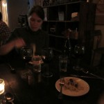
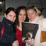
I visited a designer showhouse where a very talented and fabulous friend, Jennifer McGee, was exhibiting (see a detail from her room below). After shamelessly running my hand over the outrageous, custom Greek key molding, I was drawn to the large abstract painting by a young artist that left me thinking… Who the fuck is this guy and why don’t you know anything about him?

Edward Holland is a local artist: he lives and works in New York City and is a staff member at NYU. I went to his studio to interview the [deliberate and disarmingly handsome] painter:

What artists are you most inspired by? There are certain artists that I continually return to for answers to problems, or to remind me to let something go: Manet, Johns, Mitchell, Matisse, Bruegel, Titian… I could keep going, but that would be boring. As far as more contemporary artists are concerned, I really admire Albert Oehlen, Michael St. John, Gordon Moore…
Do you find joy in completing a piece, or is there a certain part of your process that you enjoy most? I don’t know. For me, making a painting is a constant give and take. It is like a romantic relationship: you have moments of intensity and moments of despair, moments of compromise and selfishness; and when the relationship runs its course, you walk away unsure of your feelings. While that sounds really reductive, it is true for me. After a painting is finished, I may not know how I really feel about it until a couple of years later.
Are you superstitious in the studio? No. More OCD than superstitious. I like having my brushes in a certain place, my mediums in a certain place, and my cart in a certain place. It extends to the way that I stretch and prime a canvas, how I attach the hardware, and how I inscribe the back. I am a supreme creature of habit; so these rituals and placements have been honed over time.
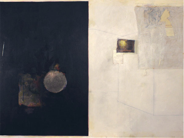
I absolutely love Edward’s work. So much, in fact, that I added a piece to my personal collection (see below). Every time I stop to really appreciate it I see new things—it’s very rewarding—there’s so much depth in his work.
More about Edward Holland: he has a BFA from Syracuse University and an MA from NYU. He has had solo shows in New York and has been a part of many group exhibitions in NYC, Santa Fe, Cincinnati, Brooklyn, throughout the Hamptons, and Venice, Italy. He exhibits with the well-known Gerald Peters Galleries of NYC and Santa Fe

HE HAS UPCOMING EXHIBITIONS AT: Gerald Peters Galleries in New York City this spring, NYU’s 80wse galleries (May 23-June 9), Peter Marcelle Contemporary in Bridgehampton this summer.

Photo credits: Lead portrait and studio shots by Meredith McBride Kipp, Jennifer McGee interior by Peter Rymwid, bottom Holland portrait by Sandra Locke.

Here is a sampling of a few of my favorite Edward Holland pieces. For inquiries about these and other works, you can contact Edward directly or call him at 917.584.6236
a painting for my nine year old self, acrylic, colored pencil, graphite and oil on canvas with collage, 36 x 36 incheshunter’s twilight (after gifford), acrylic, colored pencil, graphite and oil on canvas with collage, 36 x 36 inchesinterior VI, acrylic, colored pencil and graphite on paper with collage, 14 x 11 inches
please please me, acrylic, colored pencil, graphite and oil on canvas with collage, 48 x 64 inchesThis one is HUGE and soooo amazing!! I absolutely LOVE this piece and wish I had a wall large enough… one day…
the doomsday lollipop
: 2007, acrylic, colored pencil, graphite and oil on paper with collage, 48 x 84″

Knot your everyday craft…


I just returned from Belize abuzz with new ideas and envious of all the Belizians I met— expats and central-Americans living off the land, long-haired hammock-set retirees, and free spirits sailing the turquoise waters with but a solar panel and a fly rod.
A quote I will carry away from this trip—seen spray painted on crumbling concrete breakwater—“not all those who wander are lost,” is befittingly a J. R. R. Tolkien sentiment, penned for The Lord of the Rings. Two such wanderers I encountered were stationed in Caye Caulker—for a hot minute—selling handsome handmade macramé jewelry and enjoying the current surroundings of what Belizians call the “island of hippies” (detail shot above). Originally from Spain, Alejandro travels endlessly, hawking his unique wares wherever the wind takes him.
His work made me think of these outrageous necklaces (below) that I saw in a little shop in Sayulita, Mexico 2 years ago (pre-blog). Despite my match-making hopes, they were not Alejandro’s pieces. He has not yet traveled through Sayulita—but hopes to, as many people (not just I) have recommended it to him—also a haute hippie hotbed wrought with west coast (US & Canada) expats.
On the macramé note… Eleanor Amoroso, a young London-based designer is doing some crazy shit with macramé and knotting. J’adore her work. Here are a few of her pieces from Spring/Summer 2012 (top) and one (literally) from her graduate collection in 2011 (bottom) that she launched her brand with. Check out more of her 2012 collection in British Vogue.

Shagreen & Ivory: stuff dreams are made of

This Chiffonnier by Andre Groult is still one of my favorite pieces in The Museé Des Arts Décoratifs (also my favorite museum) in Paris. The ultra-feminine piece is an Art Deco twist on the bombe style (referring to it’s bulging design) that Groult designed for his “Chambre de Madame” (shown below) at the 1925 World’s Fair in Paris. The chiffonier is veneered in the most stunning, cream-colored shagreen, applied in a radiating pattern over a beechwood & mahogany structure, and completed with ivory fittings. It lives in a non-prominent corner of the museum, and if you’re not looking for it, you could actually miss it!

Many creatives have found inspiration in Groult’s work, but none more literally than that of designer Marc Newson. In 1987 he designed this “Pod of Drawers”—with fiberglass-reinforced polyester resin core and blind-riveted sheet aluminum—that is such an affirmation of appreciation for Groult’s 1925 piece.

Clever Craftsmanship in Outer Sunset


Am loving the work of Jay Nelson (pictured above in his studio), an artist whose work I spotted in a few places in Outer Sunset Beach in San Francisco last summer and again recently. His work is so playful and actually functional! I particularly love his Golden Gate electric Camper (above) which currently resides in the Mollusk surf shop in Outer Sunset Beach. Click here to see more of Jay’s incredible vessels/structures—they will blow your mind: Treehouse (shown below), Camper Boat, Camper Scooter, Mollusk Store Submarine Design (in the Missionin San Francisco).

Jay also constructed these fabulous jewelry displays (below) for General Store, a delicious little collaborative shop just blocks from Mollusk, (created by duo, Serena Mitnik-Miller and Mason St. Peter, business partners of Two Birds Fly) which features carefully curated items from both new and vintage sources. Local artisans and craftspeople contribute to the mix of everything from furniture to small electronics… “a little bit of everything useful!”

General Store has a gorgeous little garden out back with greenhouse by Jesse Schlesinger that is definitely worth a peek too. It will make any east-coaster (this one included) wish they had an all-season garden.

DIY Decorative Wall Treatment

Less is More! This is a simple and easy concept for a wall treatment—perfect for rooms that already have enough going on.
I cut rough 8″ squares of reclaimed wood, whitewashed them with matte paint, laid them out on on the floor to make a template and then nailed them right through the center into the wall with 3″ nails. I left the nails protruding (by 1–2″) to give the overall look a little more texture—the shadows at different times of the day give it a little depth and movement.

Beauty of the Barnes


After years of efforts to resolve financial problems (or some say years of scandal—see the documentary The Art of the Steal), the famous Barnes Foundation will (as of May 19, 2012) relocate to a new site—on the Benjamin Franklin Parkway in the heart of Phili—from it’s historic home in the suburb of Merion.

It was founded in 1922 by Albert C. Barnes, a chemist who collected art after making a fortune by co-developing an antimicrobial drug. Today, the foundation (curated by Barnes himself) possesses more than 2,500 objects—including 800 paintings—estimated to be worth about $25 billion.
Here are some of my favorites.

My Last Supper

I went to a dinner last night at City Grit, a new membership-based supper club for the underground foody world, located in the rear of a church on Prince Street in Soho. It’s a fabulous antiques and furniture shop by day and an uber-cool supper club by night. The chef there, Sarah Simmons (who was running the club out of her apartment for many years before they found this space) put together a 5-course dining experience to go hand in hand with the launch of My Last Supper, The Next Course by Melanie Daneu (author and photographer). Melanie has spent the last few years traveling around the globe to interview and shoot every world-class chef. The book—second after My Last Supper—showcases stunning portraits of each chef, along with their last meal and even the recipes! Melanie is a very well-known portrait photographer, as is her husband Nigel Parry. She also has a food/photography blog worth checking out mylastsupper.com.

Sarah Simmons’ of City Grit pulled the following 5 courses together from My Last Supper, The Next Course to give us a ridiculously tasty intro to the gorgeous book:

1. Eric Ripert‘s truffled country bread with Gabrielle Hamilton‘s soft scrambled eggs
2. Micael Symons little pork meatballs with mint and cracked pepper pasta
3. Dan Barber‘s braised pig salad
4. Daniel Humm‘s herb roasted lamb with parmesan cream grits and Suzane Groin‘s italian brocoli with shallots, garlic and red pepper
5. April Bloomfield‘s banotee pie